
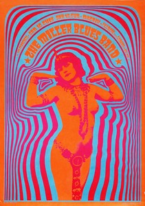


I decided to look at some music posters to get some ideas of how music is advertised and for some artistic inspiration. I noticed a lot of music posters have bold colours, shapes and font and want to explore this in my own work. I also noticed the aesthetic of many music posters go with the genre of music. I plan on doing some illustrations of musical instruments with bold colours and shapes inspired by these posters.
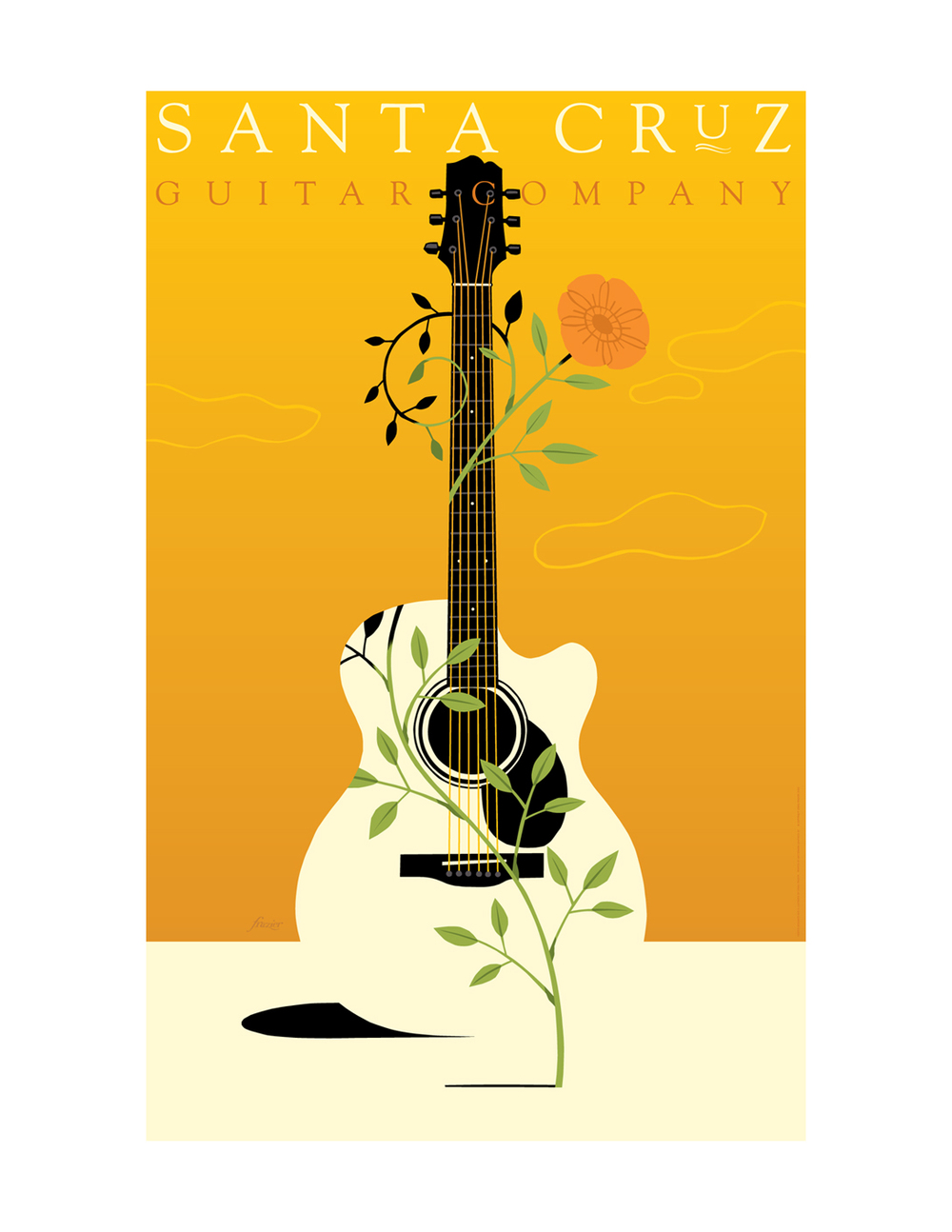
While researching music posters I came across the work of Craig Frazier. He has been an illustrator and designer since 1978.
“I like to think that one of the explanations for Craig Frazier’s expressive and memorable illustrations is that he has been—and still is—a designer. The search for a concept—and not putting anything down until a concept is found—is what makes the end product great work that communicates, often about difficult subjects.” - —Ivan Chermayeff, partner, Chermayeff & Geismar
I like his illustrations
and the simplicity in his poster designs. I am currently exploring and practicing
digital illustration so I felt inspired by Frazier's designs as a lot of his
outcomes are digital. Similarly to the posters above, Frazier uses a lot of
bright colours to catch your eye. He also typically only has one image/object
as the focal point with a simpler background. This way there isn’t too
much for the audience/viewer to look at and it catches your eye easier.

Comments
Post a Comment